Nowadays, Gothic lettering is valued for its formal, striking, and ornamental qualities. (For this reason, it is best used for decorative purposes, where people don't need to be able to read the text easily.) A Gothic script has a very definite medieval ‘feel’ to it. And it’s not difficult to produce an impressive effect in Gothic, so it’s always been a favourite with calligraphers.
Showing posts with label Gothic lettering. Show all posts
Wednesday, November 21, 2012
How To Get Started Writing Calligraphy - Italic
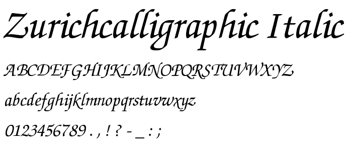
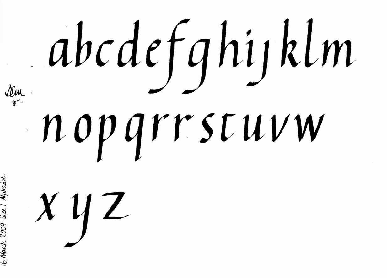
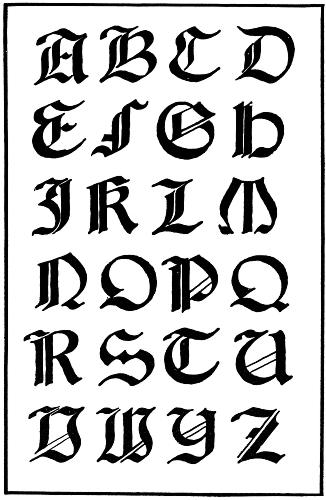
Now that I have told you about how I began writing calligraphy, I will help you get started. Before you go out and purchase any books, pens, or paper, get a pencil, and search on google: Calligraphy Alphabet. You will get to choose from many different alphabets. I suggest choosing foundational hand calligraphy, as it is extremely easy to pick up on.
Look at your computer screen, and try to replicate the letters that you find. Most likely, you'll have a hard time. First, you must remember that you are writing in a pencil, not a broad tip pen, therefore you will have different results. If your letters look just like the skeleton of the ones on the screen, you may be ready to buy a calligraphy book. (They will give you samples to copy from)
If not, practice your handwriting. Any time that you are writing something, try to write neatly. As you do this, you'll see yourself developing neater handwriting, and you'll be ready to buy that real calligraphy pen.
Gothic lettering calligraphy
However, Gothic lettering in one form or another has been used all over medieval Europe at different times. Basically, it derives from around the time when Gothic architecture was the predominant building style in western Europe, and the lettering does indeed share some characteristics with the architecture, such as a heavy emphasis on the vertical, lots of decorative elements, and an ornate regularity of style.
Subscribe to:
Comments (Atom)